|
Choropleth Maps on the CIESIN Site
by
Dr.
James R. Carter, Geography-Geology Department Illinois
State University, Normal, IL, USA
|
|
|
CIESIN provides a nice set of choropleth mapping
programs on their web site. They have given permission for my
students to make maps from these sites and post them to the web as long as
they acknowledge that the maps were generated on the CIESIN site and give
a link to that site. As of June 2003 there were three different
mapping programs on the CIESIN site. The newest package is more
powerful and flexible than the earlier versions and that newest package is
the one being discussed here.
Start by going to the CIESIN site at http://www.ciesin.org
and drop down to Data and Information: Online Tools and
Applications.
|
|
|
 |
|
|
Or, go directly to: http://plue.sedac.ciesin.columbia.edu/plue/ddviewer/ This
takes you to Online Tools and Applications, then to United States
Demographic Data Viewer. From this page select the Java Edition v3.0. This is the version
that is being used in this discussion.
|
|
|
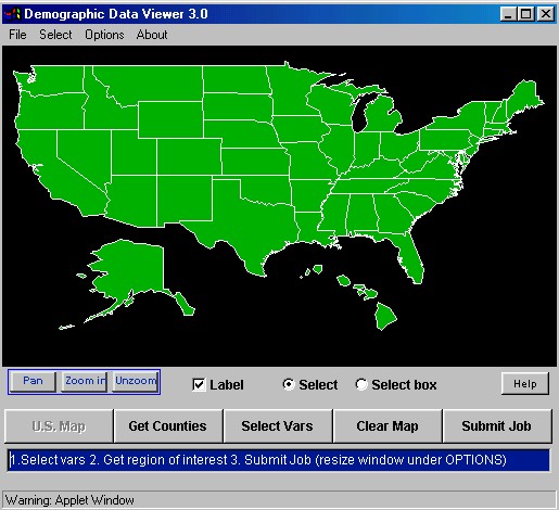
The base map that comes up is shown
below. It is a base map of the U.S. with Alaska and Hawaii fit in on
the south edge of the conterminous 48 states. Alaska and Hawaii are
not at the same scale as the conterminous U.S. The map projection
employed is the equirectangular projection, a simple projection of
latitude and longitude values onto a Cartesian grid. On this grid
there is no convergence of meridians towards the north. This is not
an equal area projection. All maps on this site are on this
projection, including maps of the individual states. |
|
|
|
|
|
Below the map base are buttons giving many
options. Note the Submit Job button. After you have
made selections, you need to toggle this button to create a new map.
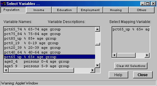
First, you want to select a variable to map, assuming you are going to
make a map of the U.S. Hit the button Select Vars and you
will get a page as below. Note first that this is 1990 Census
data. We can anticipate that soon 2000 Census data will be
incorporated into the site, but as of summer 2003 it is still 1990
data. Look at the broad subject areas that are available:
Population, Income, Education, Employment, Housing and more. For
this exercise I selected percent of the total population that is age 65
years or older. This is not the number of persons 65 and older, but
that variable is available. Having clicked on this variable it is
shown in the smaller box on the right. You can select more than one
variable at a time, but start with just one. Click Close to
return to the map. |
|
|
|
|
|
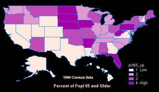
After selecting that variable and hitting Submit
Job, the following map was created. This is the default map.
The legend is in the upper left corner. It shows data broken into
four classes and the classes are labeled 1 Low, 2, 3, and 4 High.
The color scheme is yellow to red, in a fairly good graded series.
In this case the data are classified based on Quartiles, such that 1/4th
of the states are in each category. The legend does not show actual
values in each class. |
|
|
|
|
|
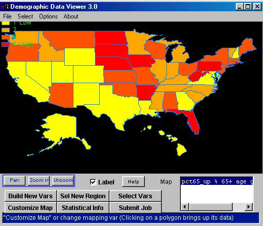
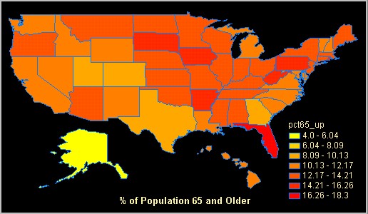
Note the Customize Map button above.
Clicking that button I was able to put the data into 7 categories broken
into equal intervals. I also repositioned the legend to put it in the
lower right corner of the image. I added a title and positioned it
below the map. I could have included a sub-title. I took the
default color scheme in this example, but I did change the color of the
text to a yellow. In general, this is a good gradation of colors,
but it is difficult to distinguish easily the top three shades of red. |
|
|
|
|
|
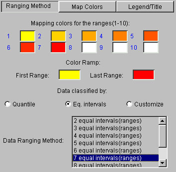
On the Customize Map site, there are
three pages. On Ranging Method page below you can select from
2 to 10 classes of Quantiles or Equal Intervals. On this page you
select the colors for the ranges of data. Double click on the yellow
box labeled First Range and pick a new color. Likewise, double click
on Last Range and pick another color. The program then fills in the
intermediate colors. Everyone should play with these color options
to get an appreciation for the problems of getting a good graded color
scheme. |
|
|
|
|
|
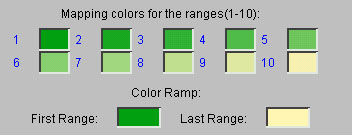
The color scheme below was created by selecting 10 intervals
and then picking a green for the First Range and a cream for the Last
Range. It was easy. Is it effective? It is hard to
create 10 colors in a sequence that can be distinguished one from
another. For this reason, you are advised to use no more than six or
seven classes in most cases. |
|
|
|
|
|
There is a Map Colors page on which you can choose
the color for titles, boundaries, background and missing values. It
works like the examples above, in that you click on a color and pick a new
color from a palette.
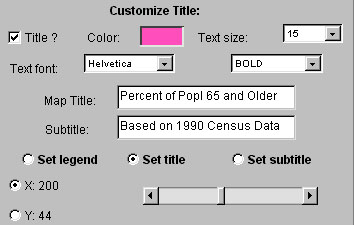
The Legends/Title page permits you to turn legends and titles on
and off, to give titles and sub-titles, to assign colors to these and
position them on the map. A portion of that page is shown
below. To see the Title, you must click to have a title. Then
type in the text for the title and for a sub-title is you want one.
Click on the Color box and pick a new color. You can choose the size
of the text and the font, as well as whether you want the text in plain,
bold, italic or bold italic. |
|
|
|
|
|
To position the title on the map, click on Set Title.
Then click the X option and move the slider to move the title left to
right. Click on the Y option and move the slider to position
the
text up or down. You will probably want to move the Legends/Title
page so that you can see where the legend is. This is not an
intuitive interface, but it works to position supplemental information on
the map.
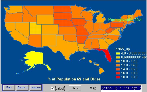
Using the processes discussed above, the map was refined to better
represent the data. First, an examination was made of the
statistical values. Alaska has the lowest percentage of persons 65
and older, being only 4.0%. The next lowest state is Utah, with
8.6%. So, it seems that Alaska should be in its own class--much
lower than any other state. At the other end, Florida has the
largest percent of persons 65 and older, being 18.3%. The next
highest state is Pennsylvania, being only 15.4%. To find these
individual values, I turned on the Label switch below the map and moved
the cursor over each state. In this example, the cursor is over
Pennsylvania and we see the state name and the data value. |
|
|
|
|
|
Given this information, I chose to set up a custom Ranging
Method. I set the lowest class to include only Alaska. The
next higher class includes only Utah and shows that the value is greater
than 8.6% but less than 10.0%. For some reason the program added
many digits to the right of the decimal point in the lowest two
classes. I was not able to fix this problem.
The range of the other classes is in even steps of 2.0%, thus having
breaks at 10, 12, 14, 16 and 18 percent. I argue that users can
better understand classes broken into whole numbers. But note that I
set the top class to go only to 18.3%. Florida of course is the only
state in that class. But, note also that no state falls into the
next to highest class. So, does this map give a better
representation of the distribution of older persons in the U.S.? I
think it does, but it may take some effort to see these distinctions.
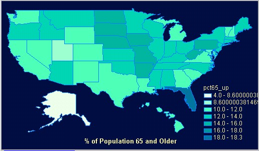
Below is still another variation of this map. In this case I
picked a unique color for each of the seven data classes. I did not
let the program fill in colors between the two extremes. In this
color sequence each color class is distinguishable, at least for my
eyes. We must realize that not everyone is able to distinguish all
of these color differences, so that this map may not be effective for
everyone. |
|
|
|
|
|
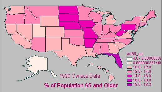
And below is still another variation of the same map.
In this case I selected colors in the pink to purple portion of the
spectrum. Again, I selected each color and did not let the program
interpolate colors between the two extremes. In this example I
changed the size of the legend text as well as the background color. |
|
|
|
|