Choropleth Maps
Choropleth Maps: are maps based on predefined areal units. These predefined areal units may include countries, states, counties, census tracts, zip codes, enumeration districts, blocks, etc.
There are many ways to map choropleth data. Two tools used to make maps on the Internet include the following:
CIESIN - Center for International Earth Science Information Network
Census Bureau American Fact Finder tool
The following Two maps were made on the CIESIN web site using the Java 3.0 version of the Demographic Data Viewer.
This first map shows the Percent of People Employed in Farming, Fishing, and Forestry in Illinois. The title and subtitle are located neatly at the top, and the legend is located at the bottom. The map is divided into quantiles of three and the map was made using a graded color scale. The data are broken into county subdivisions.
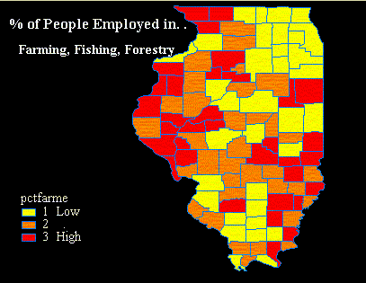
This map is well positioned and pleasing to the eye. The title, subtitle, and legend are readable and easily understood. The graded color scale is appropriate and a distinct variation from low to high can be seen. Yellow represents the counties with the least amount of farming, fishing, and forestry employment. Orange represent the counties with a moderate amount of farming, fishing, and forestry employment. Red represents the counties with the most farming, fishing, and forestry employment.
As previously mentioned, the map is divided into quantiles of three. This means that the counties of Illinois were divided into three equal groups. In this case, each color represent thirty-four counties on the map.
This second map also shows the Percent of People Employed in Farming, Fishing, and Forestry in Illinois. Unlike the other map, this map is divided into quantiles of seven and has an uneven color scale. The data are again broken into county subdivisions.
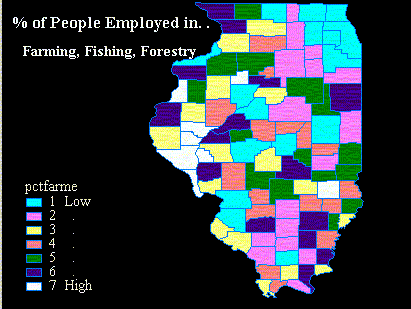
This map uses the exact same data as the previous map, but it looks much different than the first. Not only are the colors different, but the amount of colors has also changed. This map was made using quantiles of seven. All of the counties in Illinois were broken up into seven different groups, and each of these groups contains the same number of counties.
This map does not use a graded color scale. The purpose of a graded color scale is to visually show an increase or decrease relationship within a map. In this map, yellow and navy are the colors that stand out. Yet, yellow and navy have middle values. The colors used (cyan, lilac, yellow, pink, green, navy, and white) are inappropriate. They do not have a pattern and cannot show a low to high relationship.
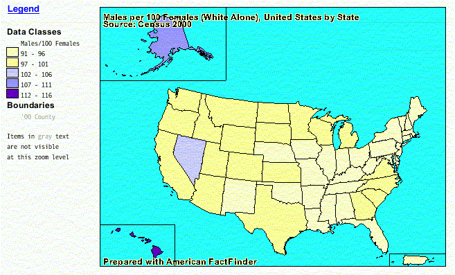
The following two maps were made using the American FactFinder Tool.
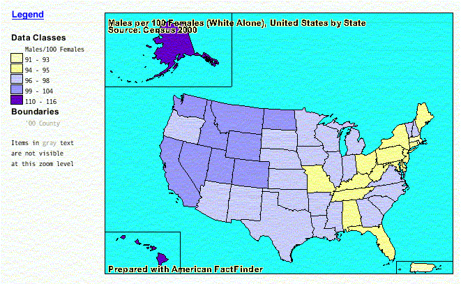
This first map shows the Male Population per 100 Females (white alone) in the United States. This Choropleth map is divided by state. A violet color scheme was used for this data which has been broken into five classes, and these classes are defined by the use of natural breaks. The number of states in each data class is not equal, and their is not an equal division in the values of the data. Instead, the data is divided by naturally occurring gaps in the data.